
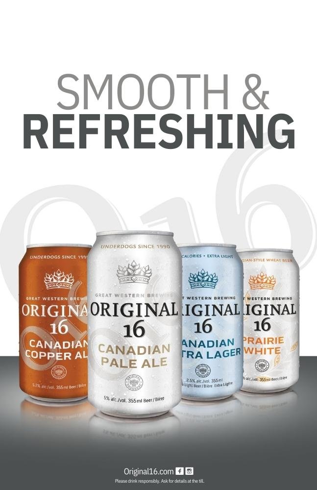
Original 16
is the premium prairie beer. Almost 30 years ago, after being told their brewery was to be closed, 16 employees pooled their resources and founded the Great Western Brewing Company. These “Original 16” underdogs risked it all to brew good beer. In celebration of this story, Original 16 was launched in 2011. Eleven years later I was tasked with rebranding Original 16.
2022
Role: Art Direction/Designer
Before

After

Original 16 is often shortened to “O16” by locals, I incorporated this bar call into the branding.
To represent that Original 16 is a premium brand, I used existing elements in a new way. For example, pulling the crown from the circle crest and using it as it’s own element in the brand.
The main objective was to rebrand Original 16 to be more modern and reflect that it is a premium beer. The challenge was to make sure the branding wasn’t too different from the original packaging as to not lose or confusing the existing customer.
Updating the Original 16 branding goes beyond the cans and box packaging. Here is the updated brand usage guide I created for the rebrand. This guide can now be referenced by all future designers when working with the brand to maintain consistency.
Click on the cover of the brand guide to view the document in its entirety.

Here are a few examples of the Original 16 branding in use.


“The packaging is getting rave reviews and it is turning into growth for the portfolio!”
- Darren Mitchell, Phoenix Group & Great Western Brewing